So now we know, courtesy of HEFCE, that higher education participation has continued to grow right up to the eve of the tuition fee reforms. Cue a plethora of responses welcoming this as progress and arguing (rightly, in my opinion) that this expansion – and the social mobility to which it contributes – is founded on, and is a worthy cause for, public investment.
I agree that this is something to celebrate – particularly the increase in students from areas where HE participation is lowest. This week marks the 50th anniversary of the Robbins Report, and has seen the Universities Minister David Willetts publish a provocative pamphlet for the Social Market Foundation, speculating on increased demand for higher education over much of the next half-century and arguing that ‘the Robbins Principle’ is still a sound one for today’s policy-makers – that HE should be available to anyone with the desire and ability to pursue it. Demand for HE is still very high, and today’s data from HEFCE shows the growth in young entrant numbers clearly.
But I am also interested in another thing HEFCE’s data highlights – how HE participation varies across the regions. Participation has grown, but are the opportunities evenly distributed? HEFCE has published some really fascinating ‘participation maps’ today that help us answer that question.
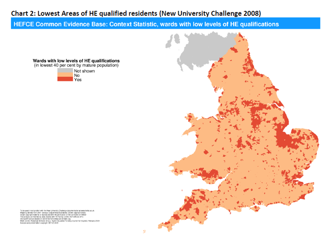
The undeniable answer is: no. And that’s not new – we’ve known about this for a long time. I dusted off some old HEFCE analysis from 2008. It’s not precisely the same as the maps published today, because it shows the overall stock of HE qualifications in English and Welsh wards, rather than young participation. But it makes for an interesting story. Not only has the pattern not changed much; potentially the maps also point both to low aspiration and to challenges for local economic development.
Here’s the analysis HEFCE did in 2008 of English and Welsh wards, based on the 2001 census and other sources. It highlights wards with the lowest rate of HE qualifications in a darker colour. It’s evident where these ‘cold spots’ are.
(Click on image to expand)
Compare that with HEFCE’s map of young participation, published today and based on the proportion of young people entering HE during the 2005-06 and 2010-11 academic years. It highlights wards with a lower participation rate in red, orange and yellow shades. It’s evident that things haven’t changed much, even if the overall number of participants has increased.
(Click on image to expand)

The explanation for this unevenness would require a much deeper analysis. Are there too few opportunities in some localities or is it that aspirations or attainment are too low? Regardless of the answer, the unevenness is important.
It matters to many individuals who live in certain places and don’t fit the traditional definition of what a student looks like – people living in ‘cold spots’ but looking to study locally, people with work commitments looking for part-time study to change or enhance their career prospects.
It also matters for the localism agenda – why should people from one ward have fewer opportunities to get on in life than another? What are the implications for local employment and local economic growth? Should policymakers be doing more to address the distribution of HE places across the country?
In the spirit of Robbins, the Universities Minister has laudably talked this week about the future expansion of HE, about ‘freeing up’ universities and colleges from caps on student numbers and ensuring that funding ‘follows the student’. I hope he will also be considering today’s regional data when thinking about how to do this.